
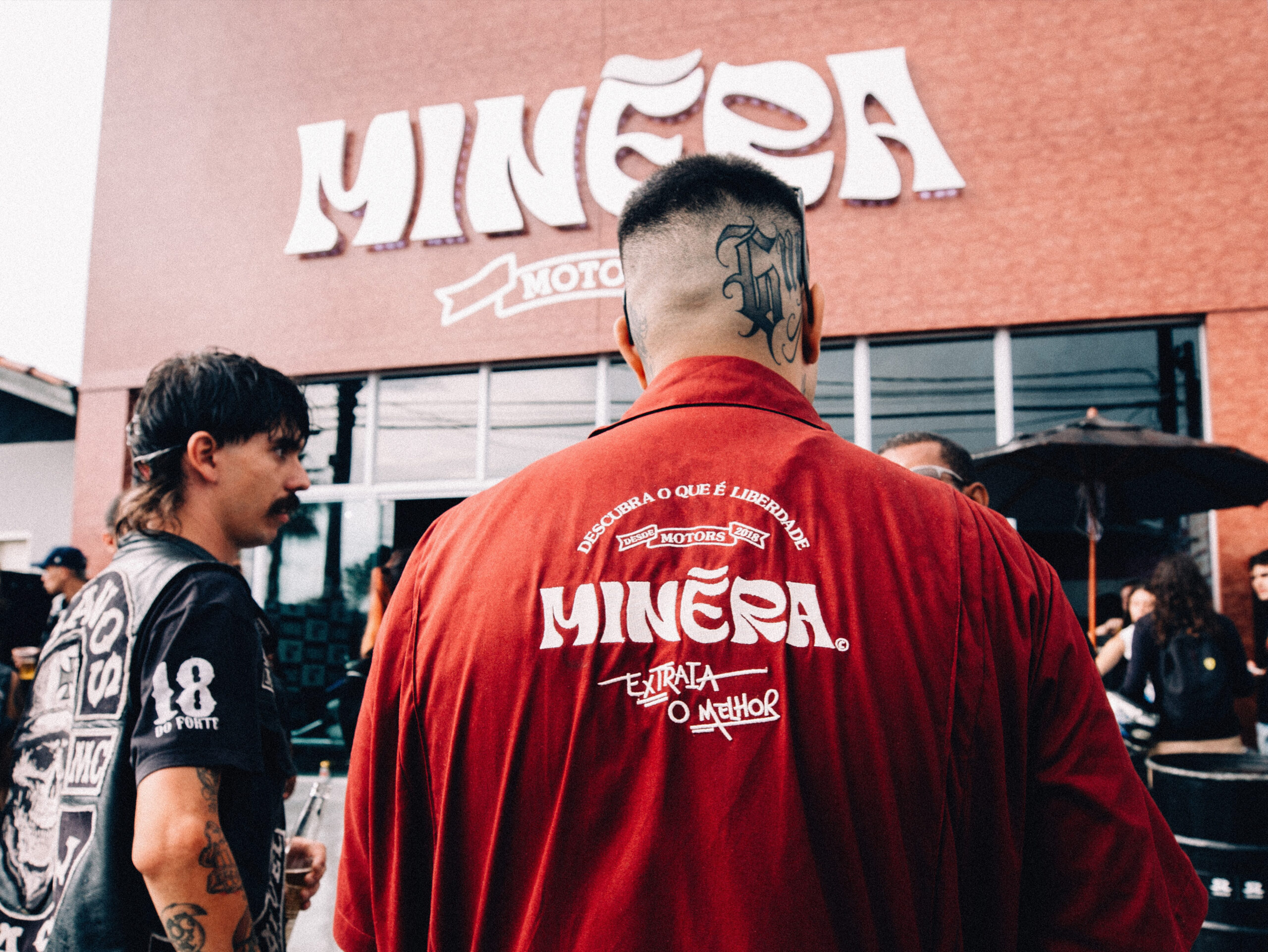
Minéra
Deliverables
Repositioning + Naming + Brand Identity
Repositioning / Naming / Brand Identity
Ryan Pinheiro
Motion
Dillan Sampaio
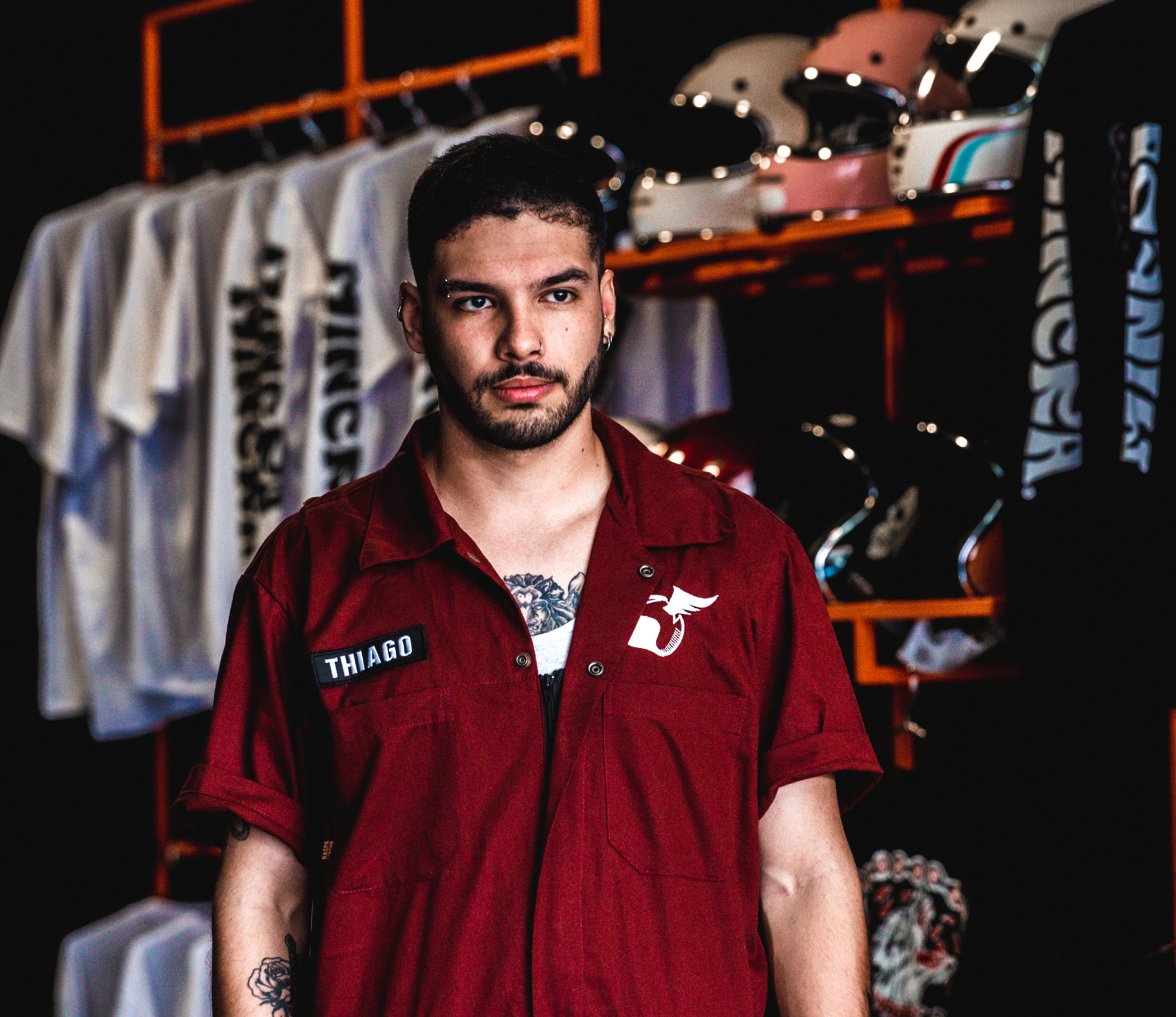
Photos
Alle Barte
Client
Minéra, Botucatu-SP, Brazil
Year
2022
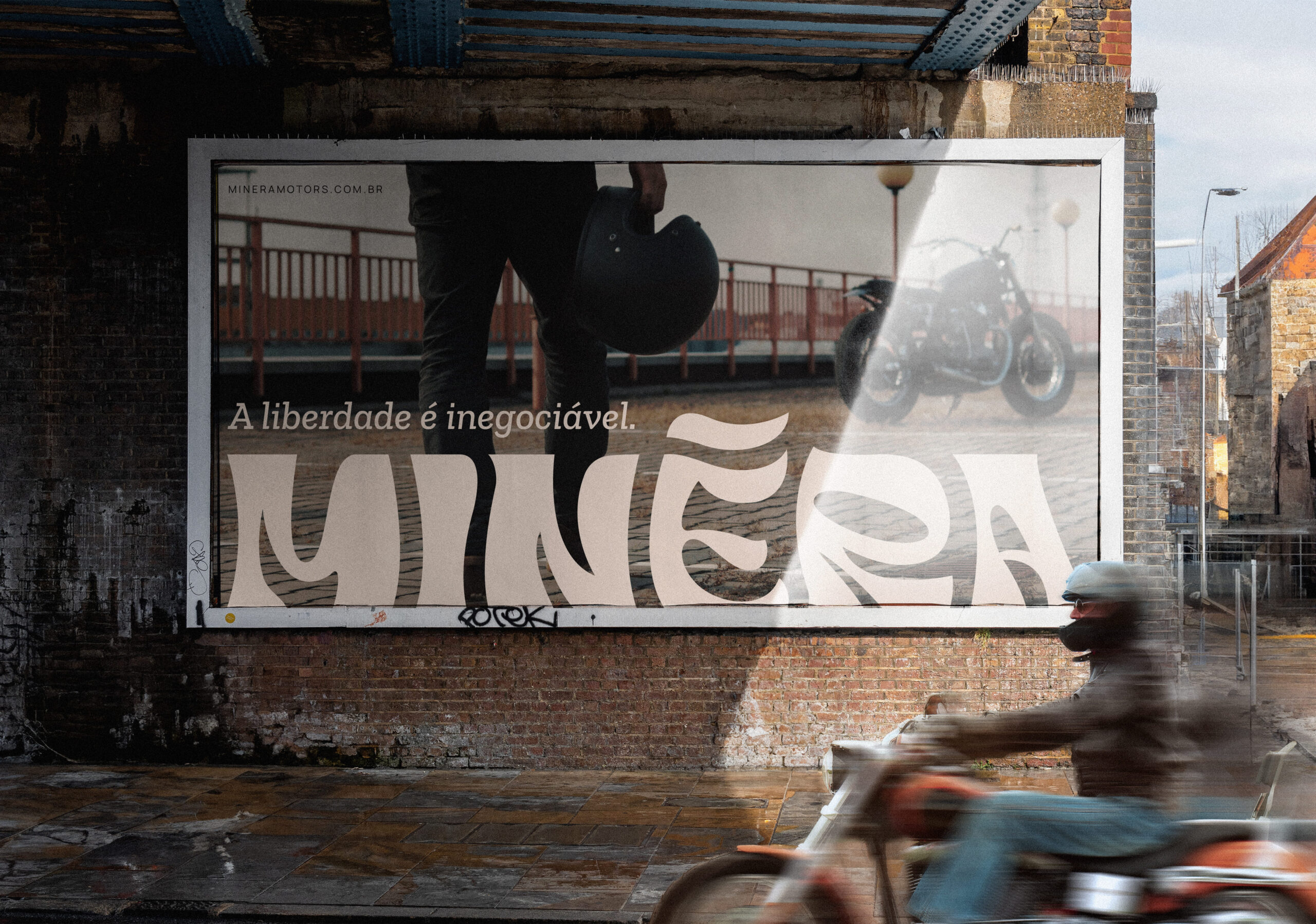
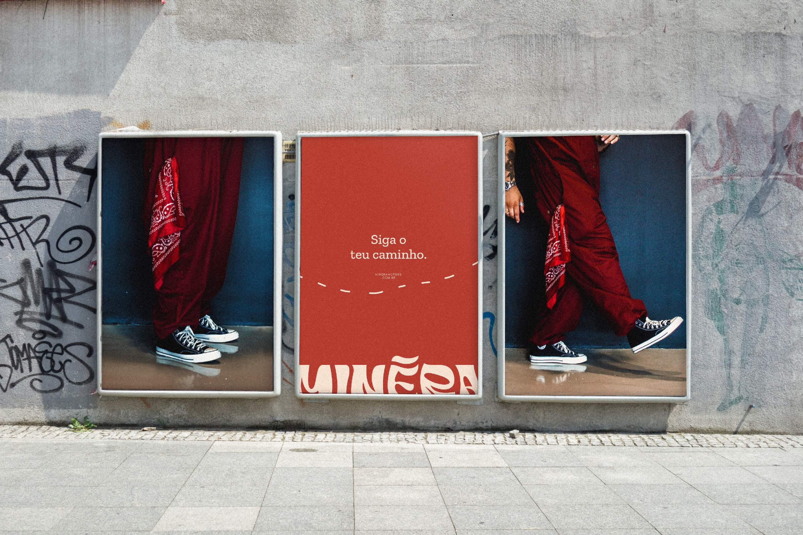
A way of living.
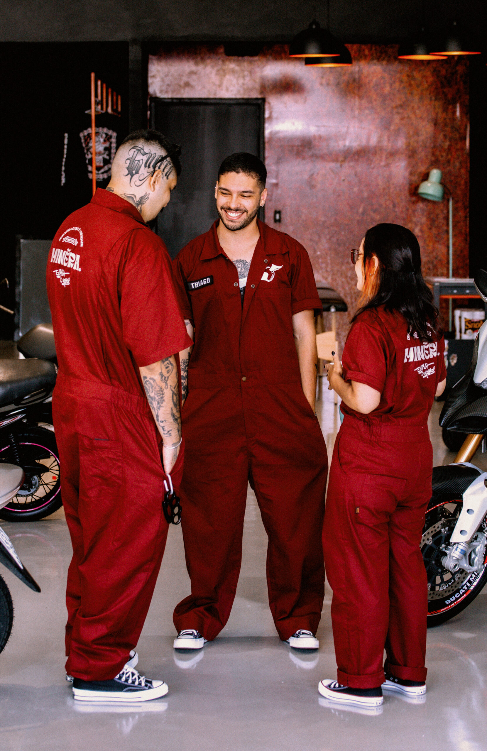
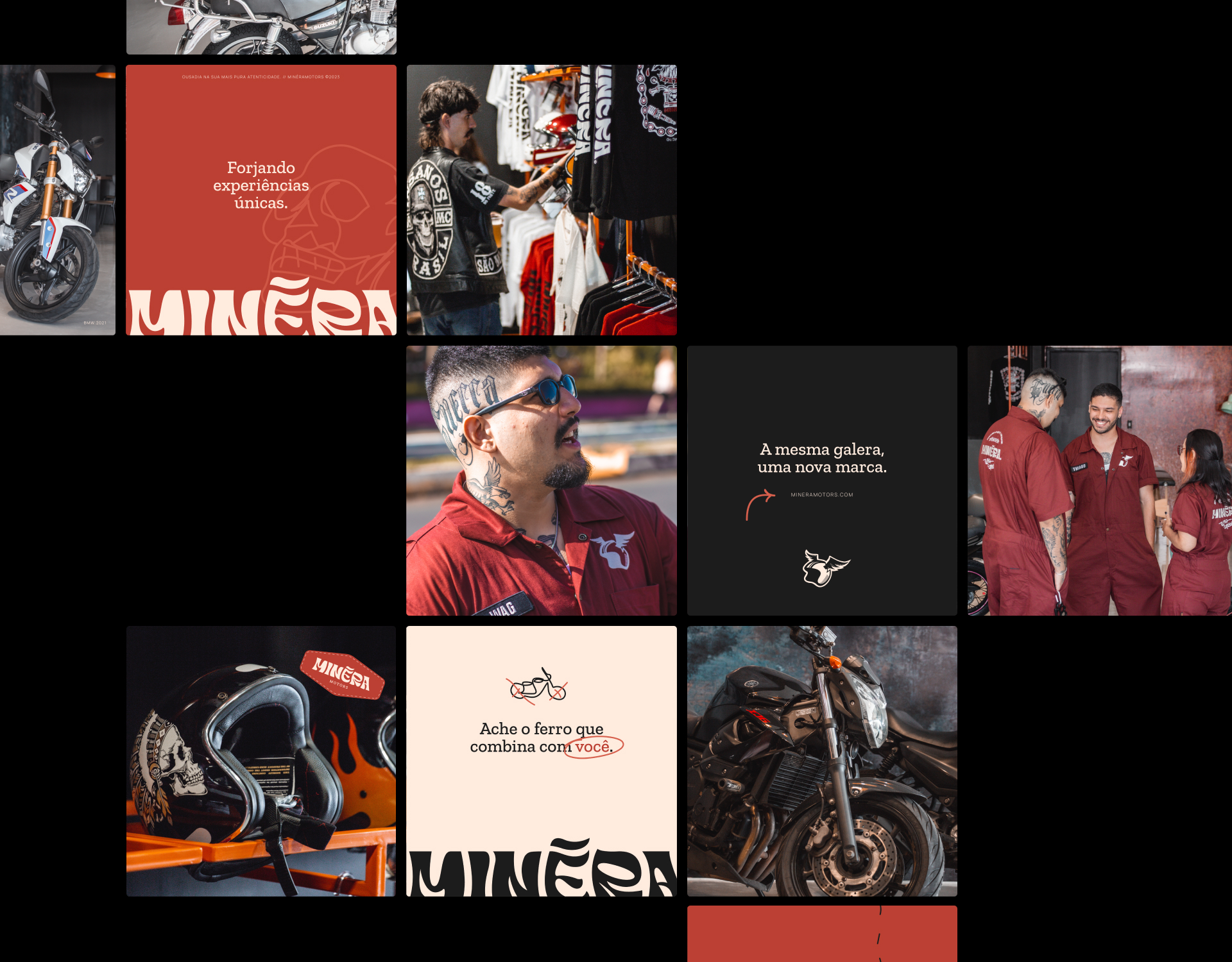
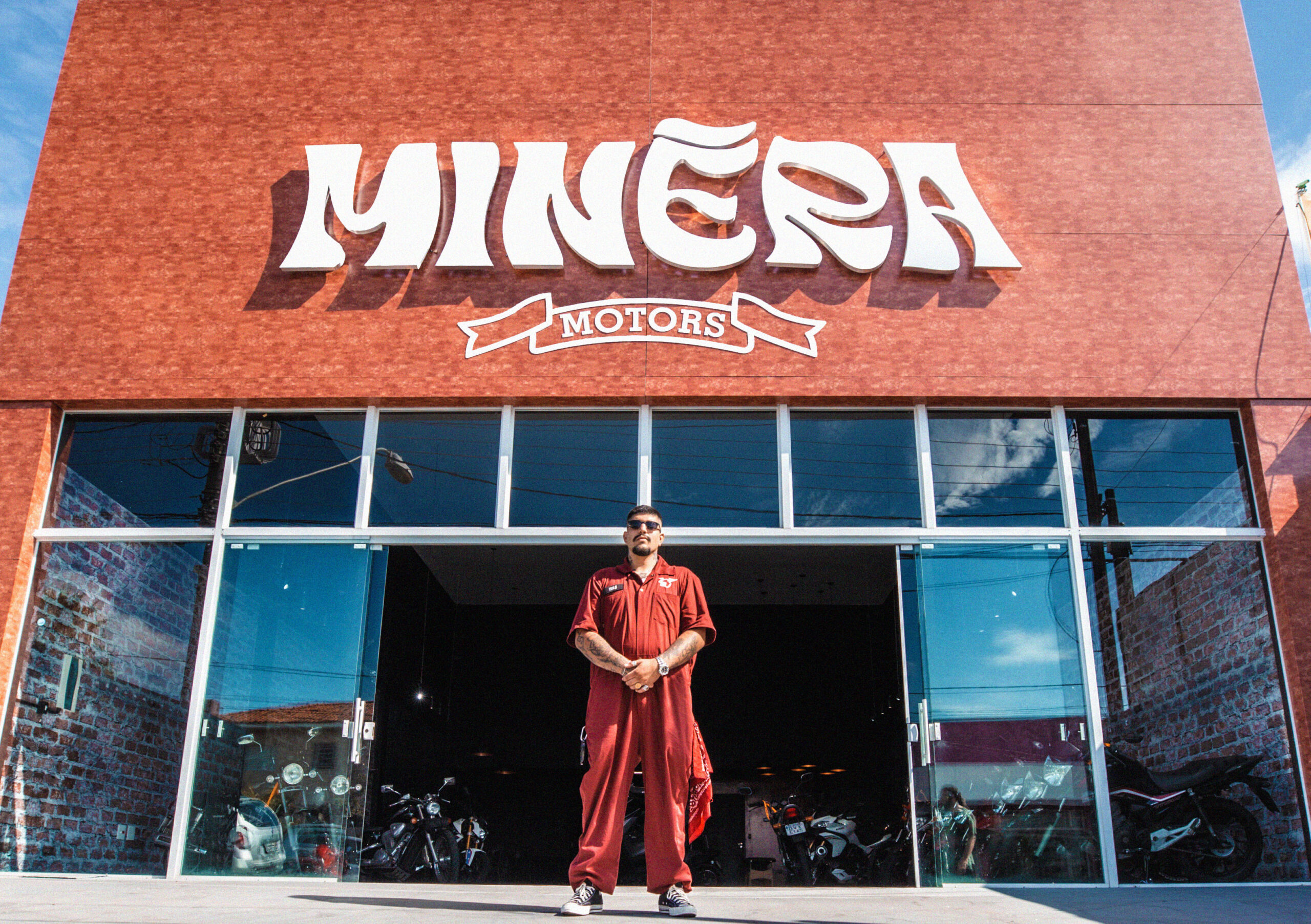
Along with its motorcycle store, Minéra also runs a number of other businesses with the same goal in mind: to provide people authentic freedom through the purchase and sale of motorcycles as well as through customization, grife, events, and tattooing. Desvinculating the owner’s name and image was the project’s challenge, with the goal of expanding and scaling with a new position, name, and visual identity that made sense at this new juncture. The main idea was passed down from the original owner, who stated that the relationship between iron, aluminum, and metal may have contributed to the origin of its function.
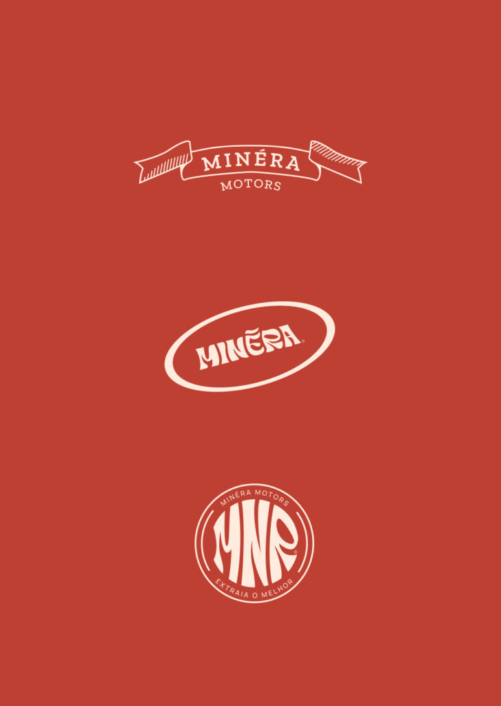
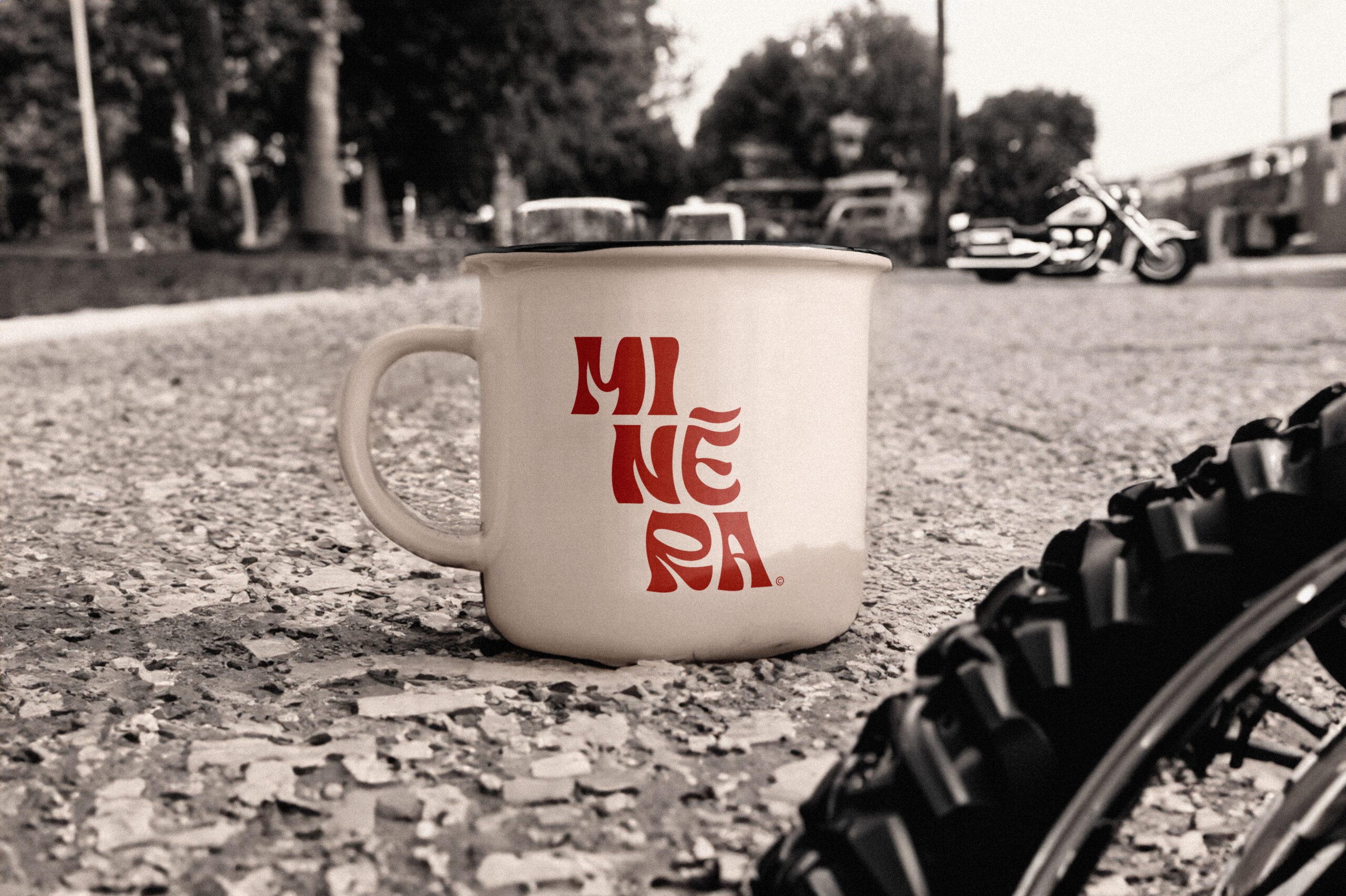
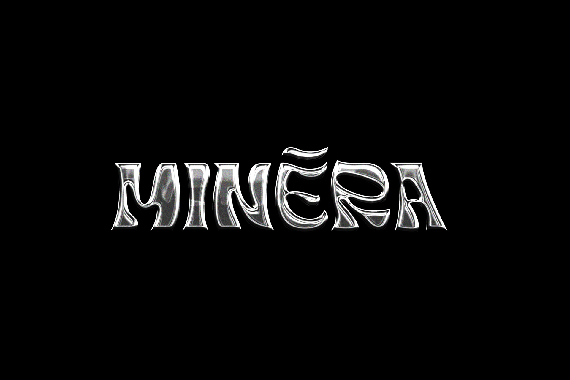
The word “ore” in portuguese is “minério” and served as the inspiration for the name’s origin as the primary component of motorcycles. They are moved by creating intense experiences and figuring out what “ferro” is best for each individual. The brand’s identity needed to convey every sentiment and attitude the company had in its most basic form, therefore I created a logo that, while being strong, also speaks to flexibility. The way the letters are nested one inside the other gives the impression that they were forged from a single mineral.
Um estilo de vida.
Além de loja de motos, a Minéra possui diversos braços que seguem dentro do mesmo propósito, levar liberdade para as pessoas de forma autêntica através da compra e venda de motos, customização, grife, eventos e tatuagem. O desafio para o projeto foi desvincular a imagem e nome do proprietário, visando a expansão e escala com um novo posicionamento, nome e identidade visual que fizessem sentido para esse novo momento. O conceito principal traduzimos do próprio proprietário, o qual citou que a relação do ferro, aço e metal poderiam remeter à origem de seu ofício.
A origem do nome veio da palavra “minério”, inspirando-se em sua origem, a matéria-prima das motos. Forjar experiências intensas e achar o “ferro” ideal para cada pessoa é o que os move. Já a identidade deveria expressar toda ousadia e atitude que a marca possui em sua mais pura essência, portanto, foi feito à mão um logotipo que ao mesmo tempo que fosse pesado, também remetesse à flexibilidade. As letras se encaixam umas na outras, dando o aspecto que foram forjadas a partir de um só minério.

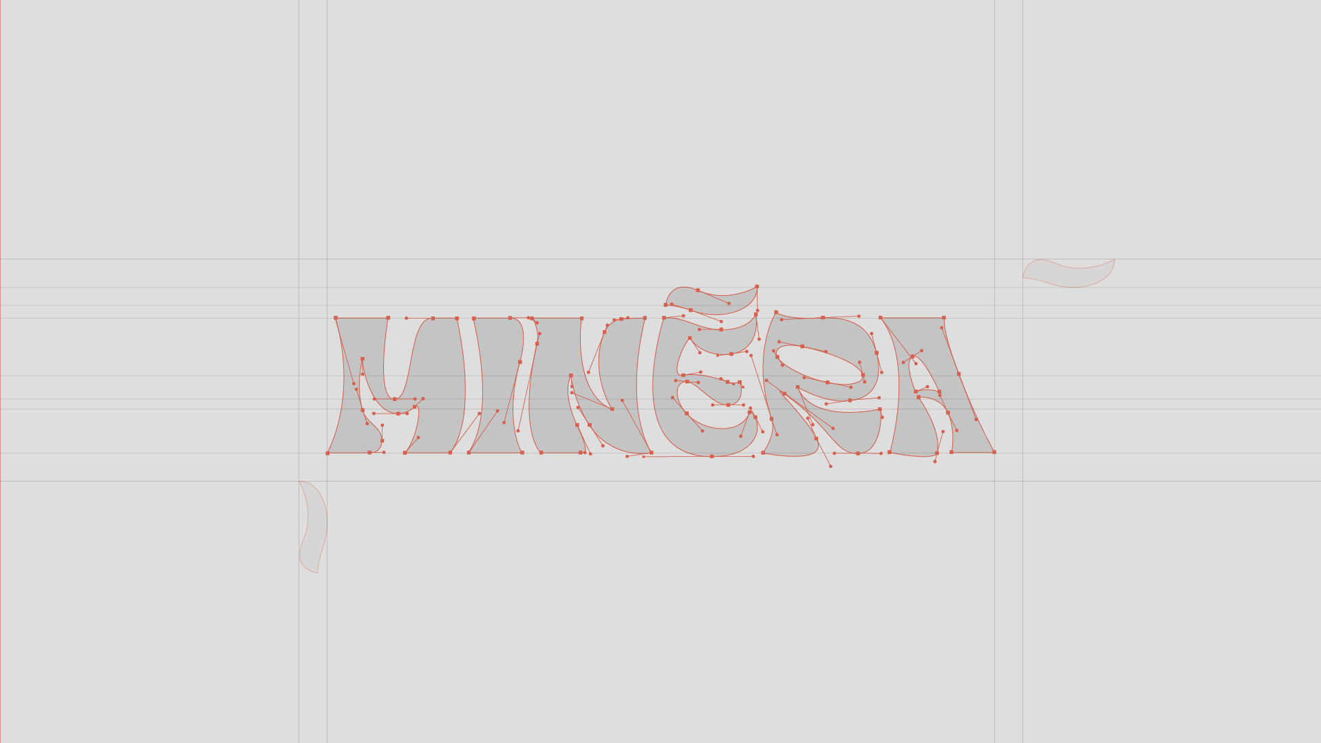

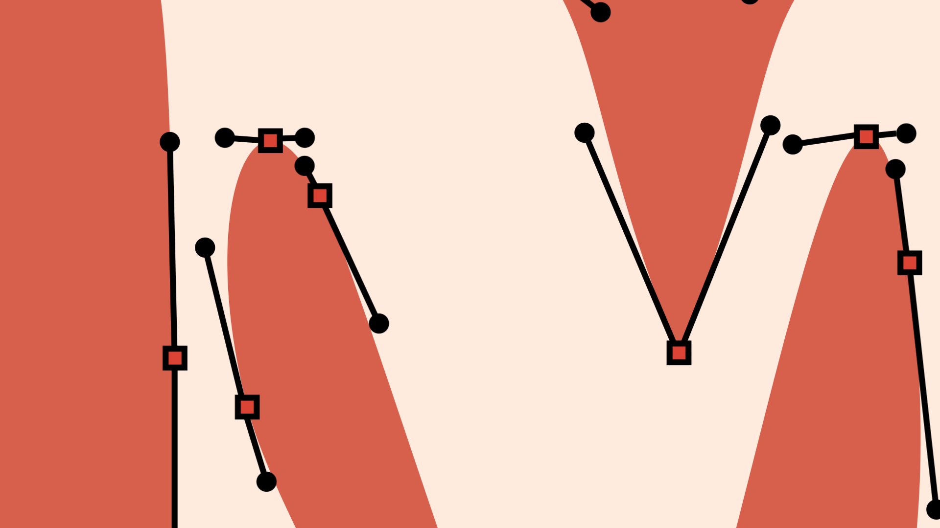
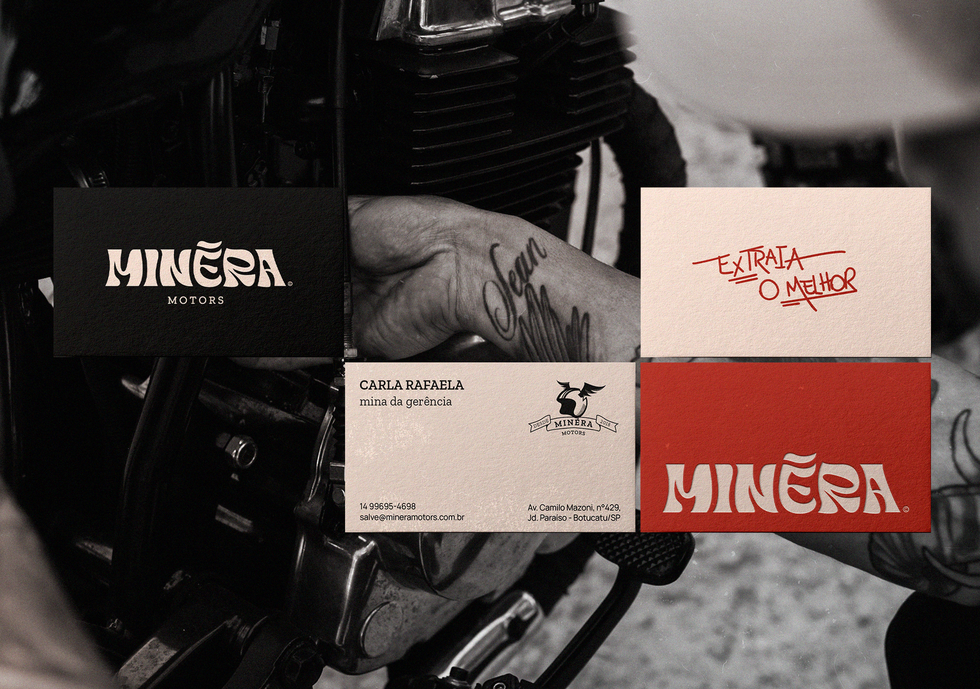
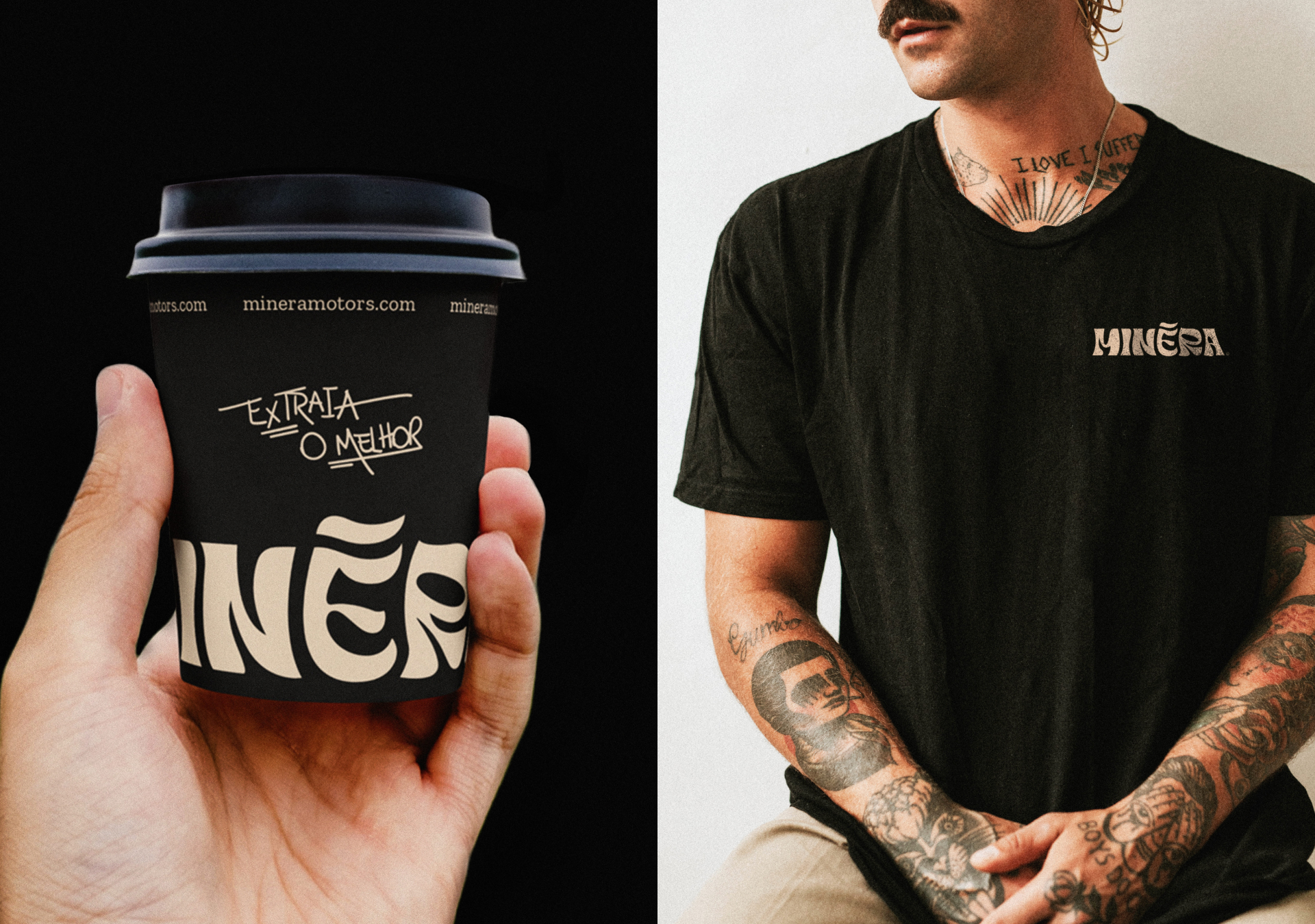
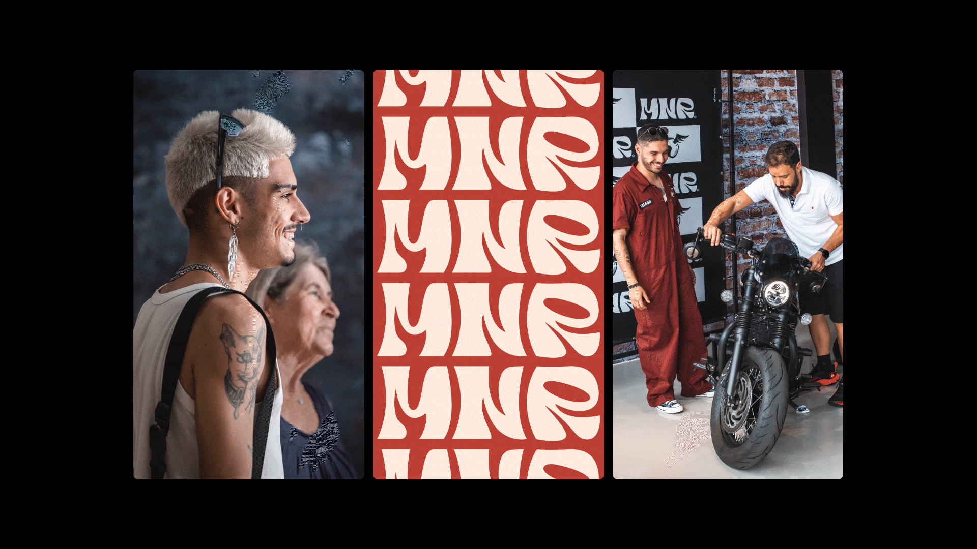
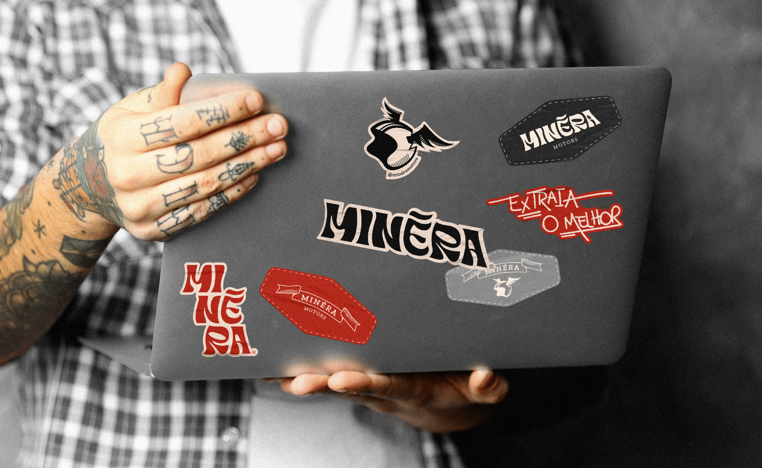
LETTERING AND SYMBOL / LETREIRO E SÍMBOLO
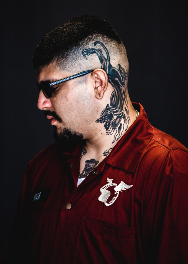
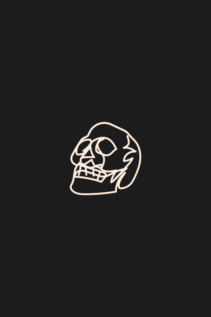
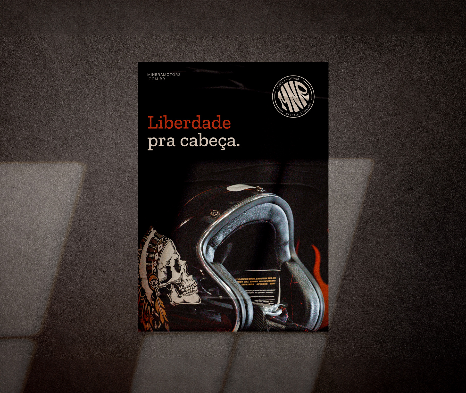
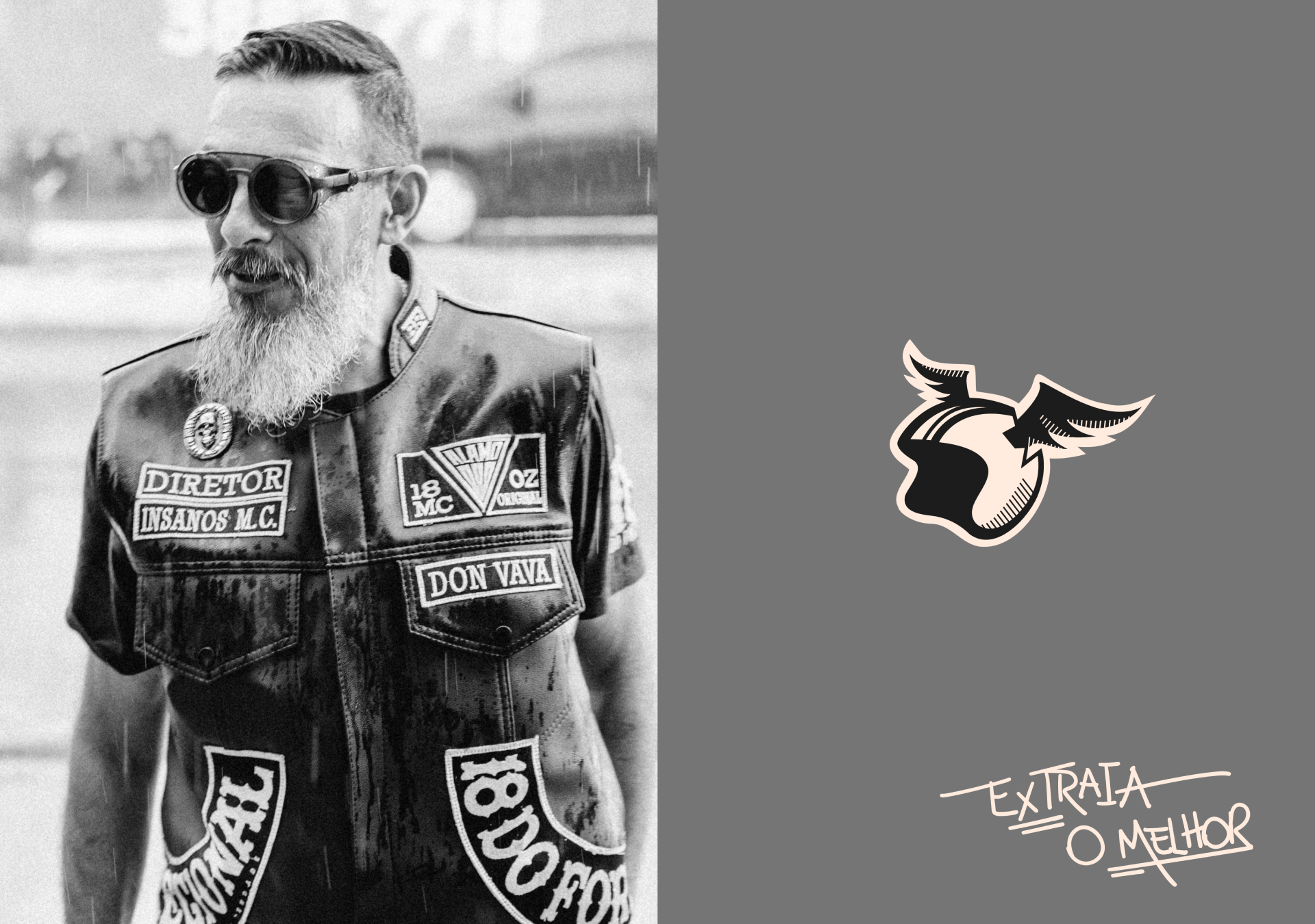
We wanted to emphasize the weight of the brand in the lettering, thus we hand-crafted a robust typeface that represented the concept of something hard but flexible, like when forging ore. The brand has an alternative atmosphere, blending irreverence and styles from different tribes like hip-hop (graffiti) and old school (80s and 90s). The brand’s independence and rebellion are symbolized by its insignia, a real helmet with wings breaking it. The classic Urban Tracer Double D helmet model was the inspiration for the symbol.
Buscamos reforçar no Lettering o peso que a marca possui, criando manualmente uma tipografia personalizada e robusta, que transmitisse a essência de algo forte, mas maleável, como ao forjar o minério. A vibe da marca é alternativa, transitando entre tribos do hip-hop (grafites e pichos) e old school (anos 80/90), combinando a irreverência de ambos estilos. Já seu símbolo, é literalmente um capacete com asas quebrando-o, incitando a liberdade e rebeldia da marca, o modelo do capacete foi inspirado no clássico Tracer Double D da Urban.

BRAND MANIFEST / MANIFESTO DE MARCA
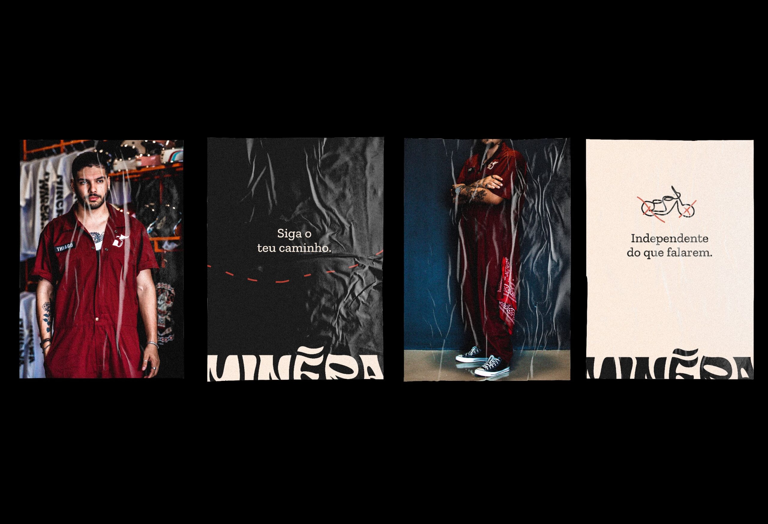
“Freedom is the way for a life that is simple and happier. If you enjoy living the way we do, without any restrictions, with your feet on the ground (or the pedal). Choosing how to obtain freedom is the question. You need to give it some careful thought, research your best options, and see what works in your budget. You must MINERAR (extracting), and for that, take the best from it, and decide what each person needs in specificly. The staff here works to ensure that you come in, share ideas, and leave with friends and the perfect motorcycle for you. The best way to learn about the world’s other side, bro… It doesn’t have to be difficult; all you need is your iron.”
“A liberdade é o combustível pra uma vida mais simples e feliz. Se sentir vivo, sem amarras, com os pés no chão (ou no pedal), vivendo do nosso jeito. Escolher como alcançar essa liberdade que é a fita. Precisa pensar bem, estudar a melhor opção e o que cabe no seu bolso, tá ligado? Pra isso tem que MINERAR, extrair o melhor, escolher pelo detalhe e a necessidade de cada um. A galera aqui trabalha pra você chegar, trocar uma ideia e sair com amigos e a moto ideal pra você. O caminho pra conhecer o outro lado do mundo, irmão… Não precisa ser complicado, pode ser você e seu ferro.”
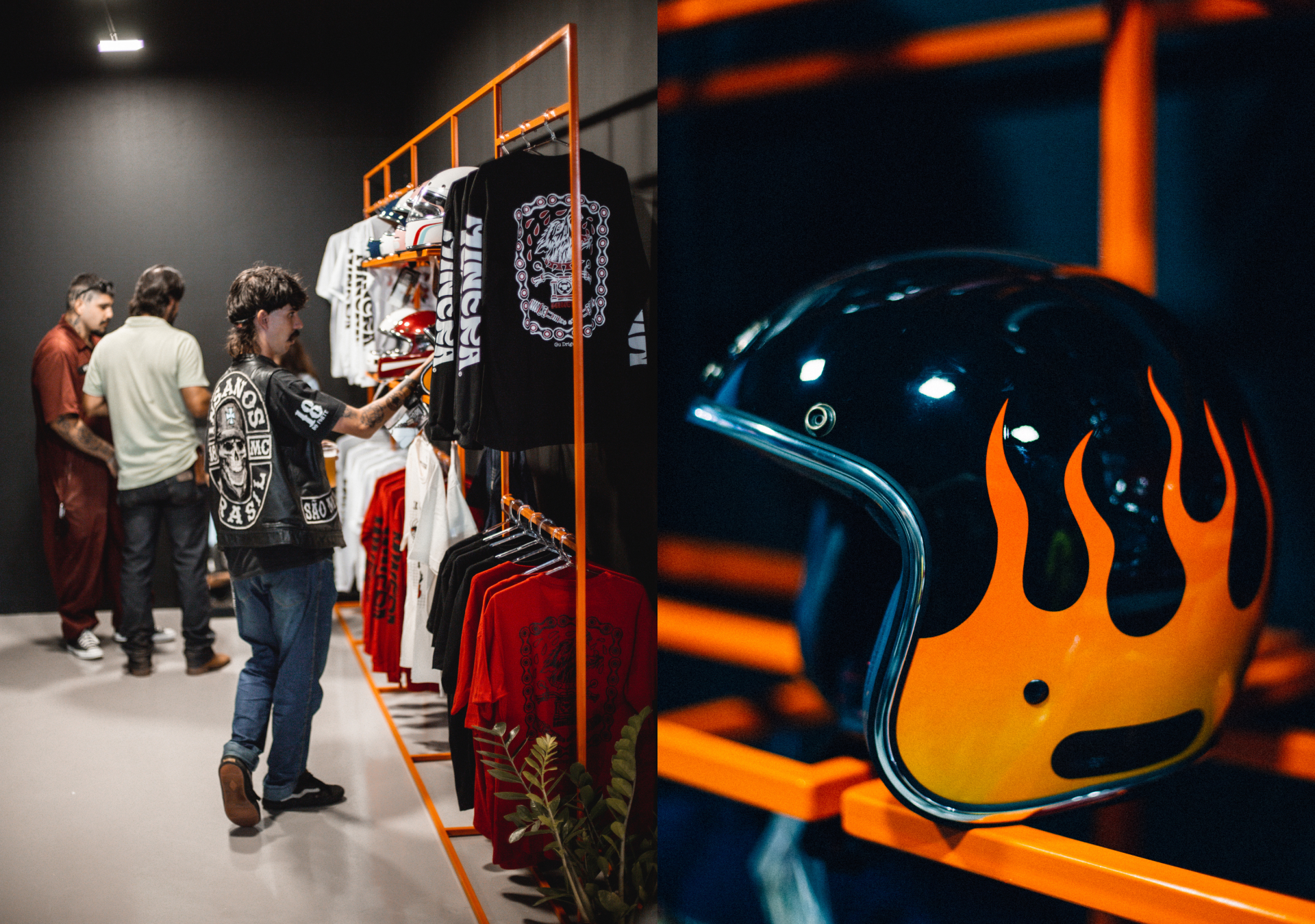
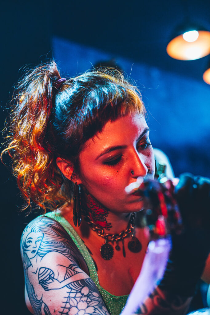
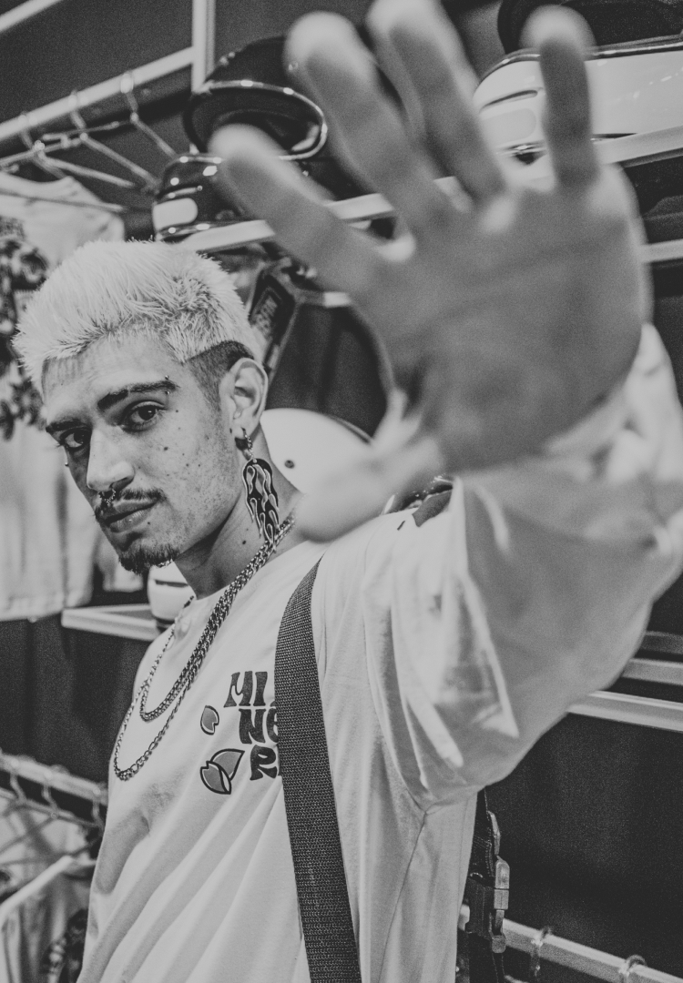
ALSO A TATTOO STUDIO / TAMBÉM UM ESTÚDIO DE TATUAGEM
The company has a tattoo parlor inside of it to support regional artists and promote culture and art in the area. The artwork created for the brand was inspired by pichos (urban style) and old school tattoo themes. In addition, they form partnerships with these artists to create prints for their own t-shirt brand.
A empresa possui em seu interior um estúdio de tatuagem para apoiar artistas locais e promover a cultura e arte na região. Os grafismos criados para a marca foram inspirados em pichos (urban style) sob temas de tattoos oldschool. Além disso, fazem parcerias com estes artistas para a criação de estampas para sua própria grife de camisetas.


Vamos construir juntos a sua marca?